Exalt magazine
I had the opportunity to design a magazine folio for the concept of a worship magazine–“Exalt.” Its target demographic is young worship leaders. The magazine’s aesthetic is progressive, unique, and mindful. Light purple and blue are used due to their calming effect and trustworthiness. I selected the font in my masthead because it naturally catches one’s eye due to the boldness of the font and the beautifully stretched arms of the “E.” The photos of people worshiping encourage the reader to connect with the articles in the magazine. All the pictures were photographed by me.
Menu
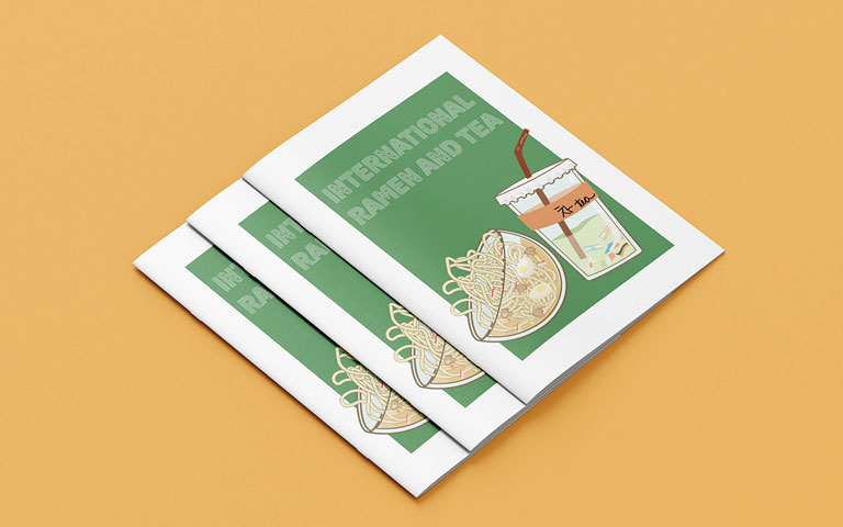
I was tasked with creating the menu for International Ramen and Tea, a fusion ramen and boba restaurant. Its target audience are
food-adventurous people from 17-35 years of age. For the front cover, I chose to use an illustration. Flags are used instead of boba pearls. The flags show that this restaurant serves food from countries all over the world. The heading font evokes the feeling of a late-night restaurant storefront. For consistency, a san-serif font is used for the menu items. Both typography choices and illustrations were chosen to make the design and layout modern and fresh.


